Design Engineering Case
Flex Academy: One Source of Truth
A take-home concept for The Flex / Base360: a landing page that sells two programmes to two different audiences, built as a connected system of Figma variables, coded components, Storybook docs and a live prototype.
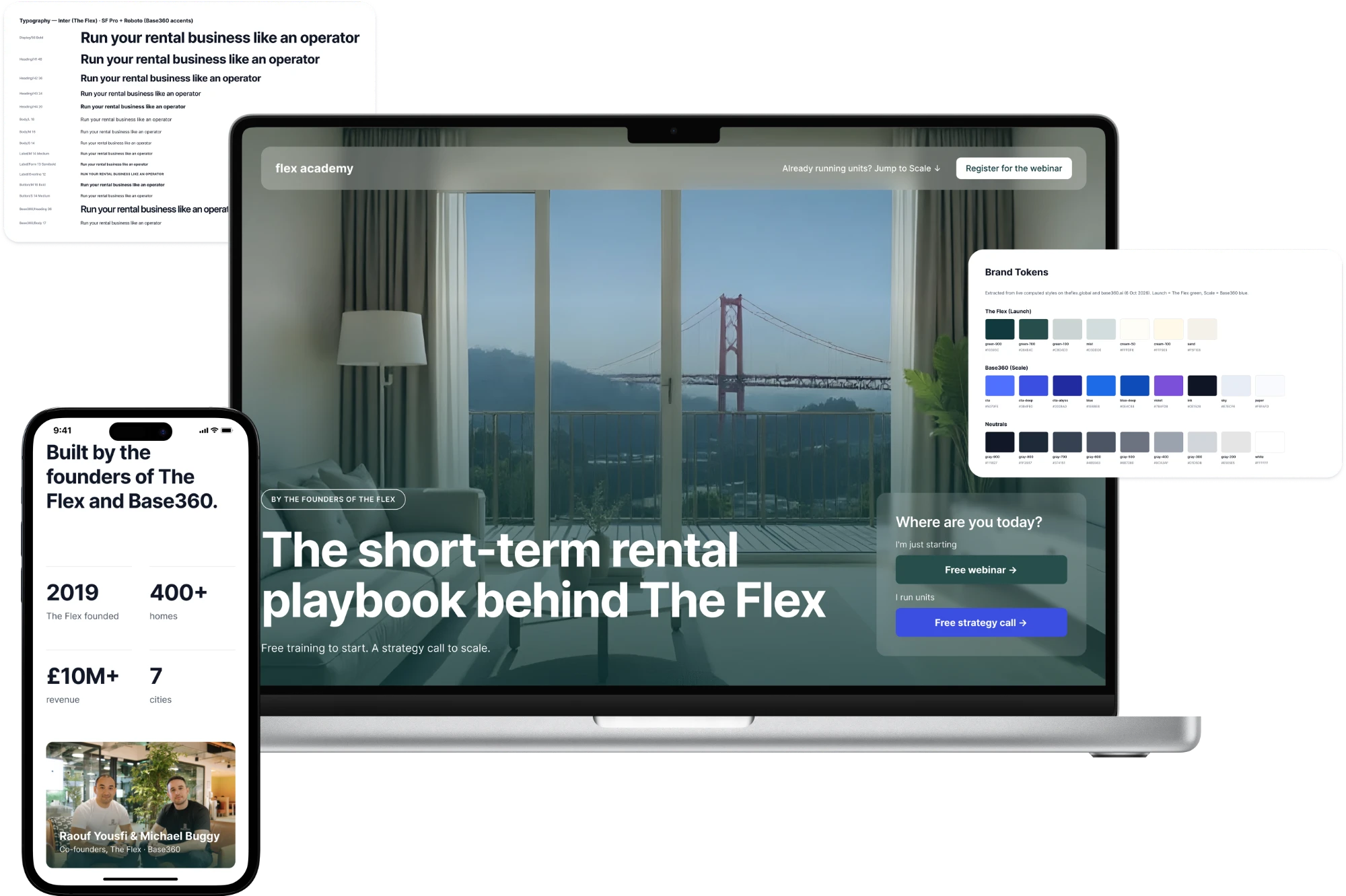
About the Project
Introduction
Flex Academy is a new product from The Flex, a furnished-apartment operator since 2019, and Base360, the AI platform for short-term rental (STR) businesses that grew out of it. The Academy teaches people to launch and scale an STR business with the same playbook, systems and software. The brief asked for one landing page for two programmes, Launch and Scale, as a design task only. I also turned the page into a small design system in code to show how I work end to end.
My Role
Product Designer, owner of the process.
Strategy, UX, UI, design system, rules for the AI tools and review of every change.
Timeline & Type
3 days of active work (5–7 Oct 2026). A take-home design assignment and a concept, not a production or client project. Development was outside the brief; the code and Storybook were my own extra.
Tools Used
Figma (Variables, Variants) · Storybook 10 · Next.js 16 · React 19 · TypeScript · Tailwind CSS v4 · Claude Code · Figma MCP · GitHub · Vercel
The Challenge
Problem Statement
One page had to sell two offers to two very different people: a “9-to-5 leaver” who hasn't started yet, and an early operator who already runs a few units but is stuck on manual work and thin margins. The audience is busy and openly sceptical of “guru” courses. How might one page earn trust fast and let each visitor act on the offer that fits them?
Breakdown of the Problem
Two audiences, one page
A beginner and an operator have different pains, trust levels and readiness to act. A page that talks to everyone the same way convinces no one.
Built-in scepticism
The education market is full of “guru” courses, so trust has to appear before any pitch.
Gap between design and code
A take-home usually ends with static screens. I wanted design decisions to live in code without drift: change a token once and Figma, Storybook and the site update together.
Clear success criteria
Within 5 seconds you know what this is, within 30 seconds you trust it, and you can act from anywhere on the page.
Key Screens
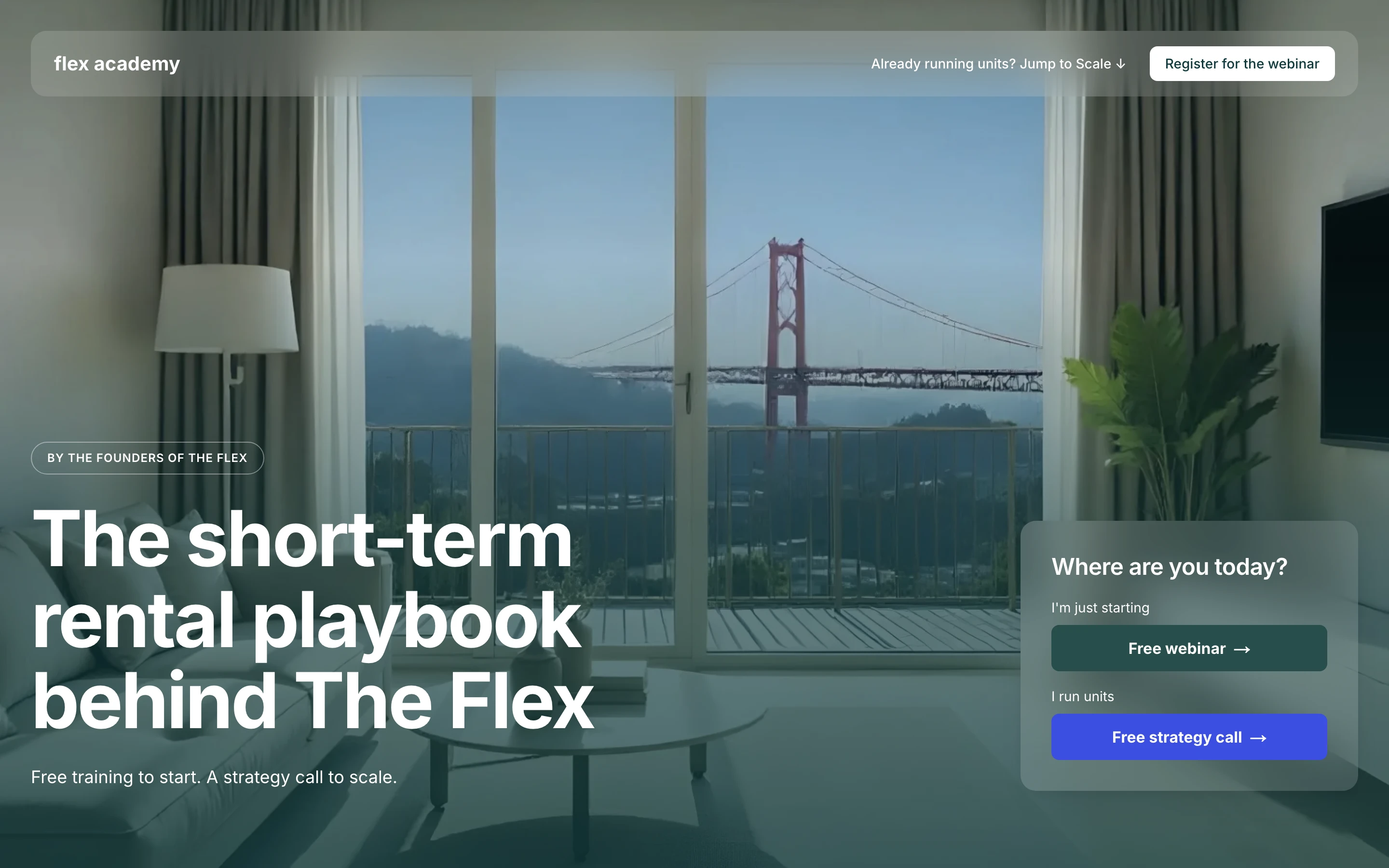
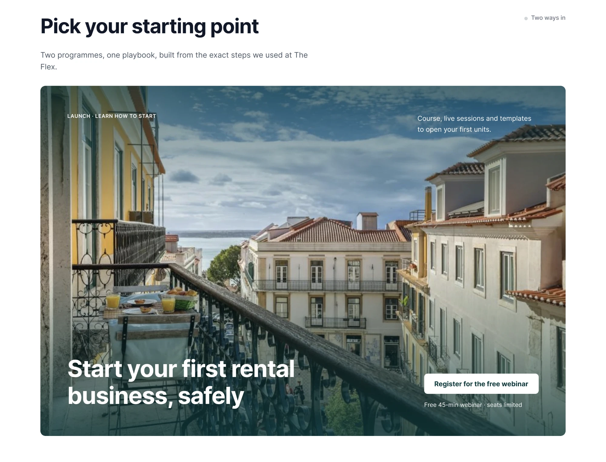
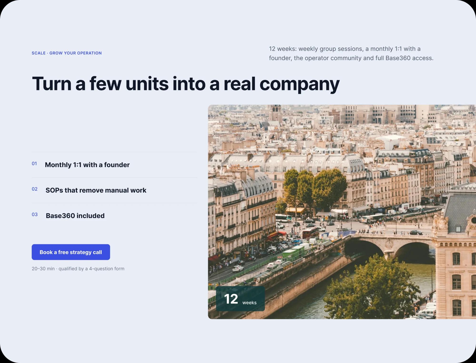
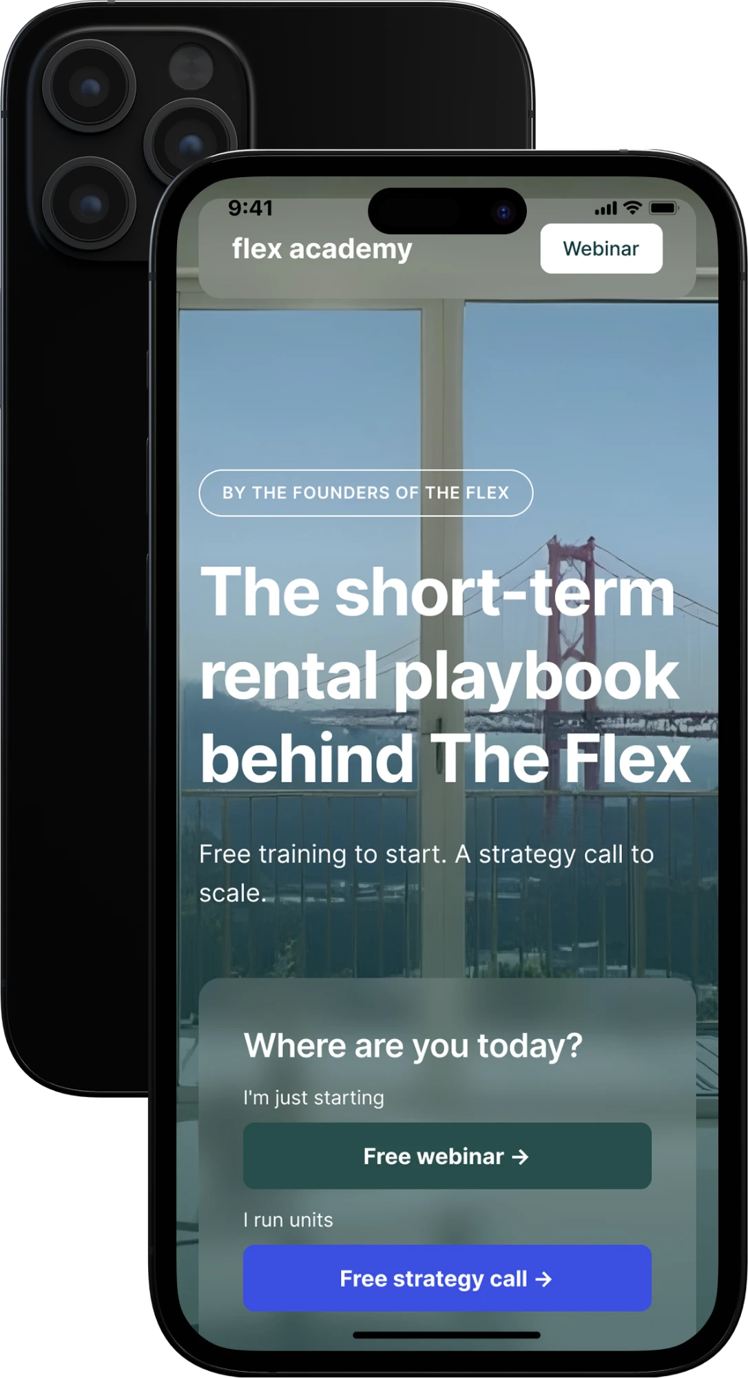
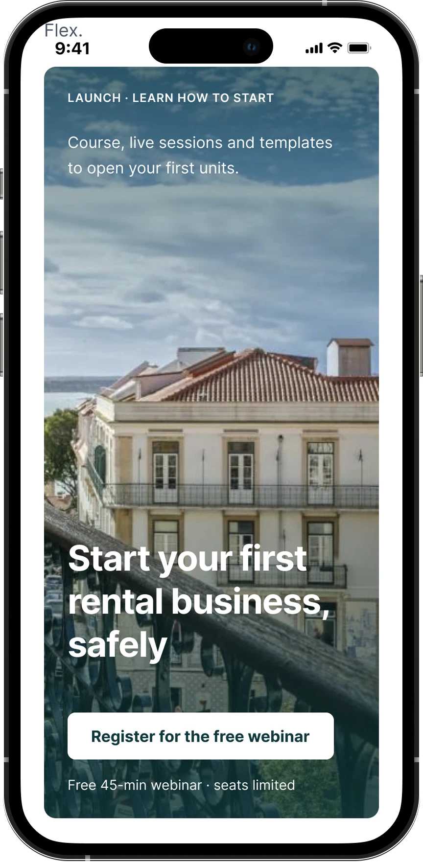
Hero with two entry paths: Launch in green, Scale in blue.
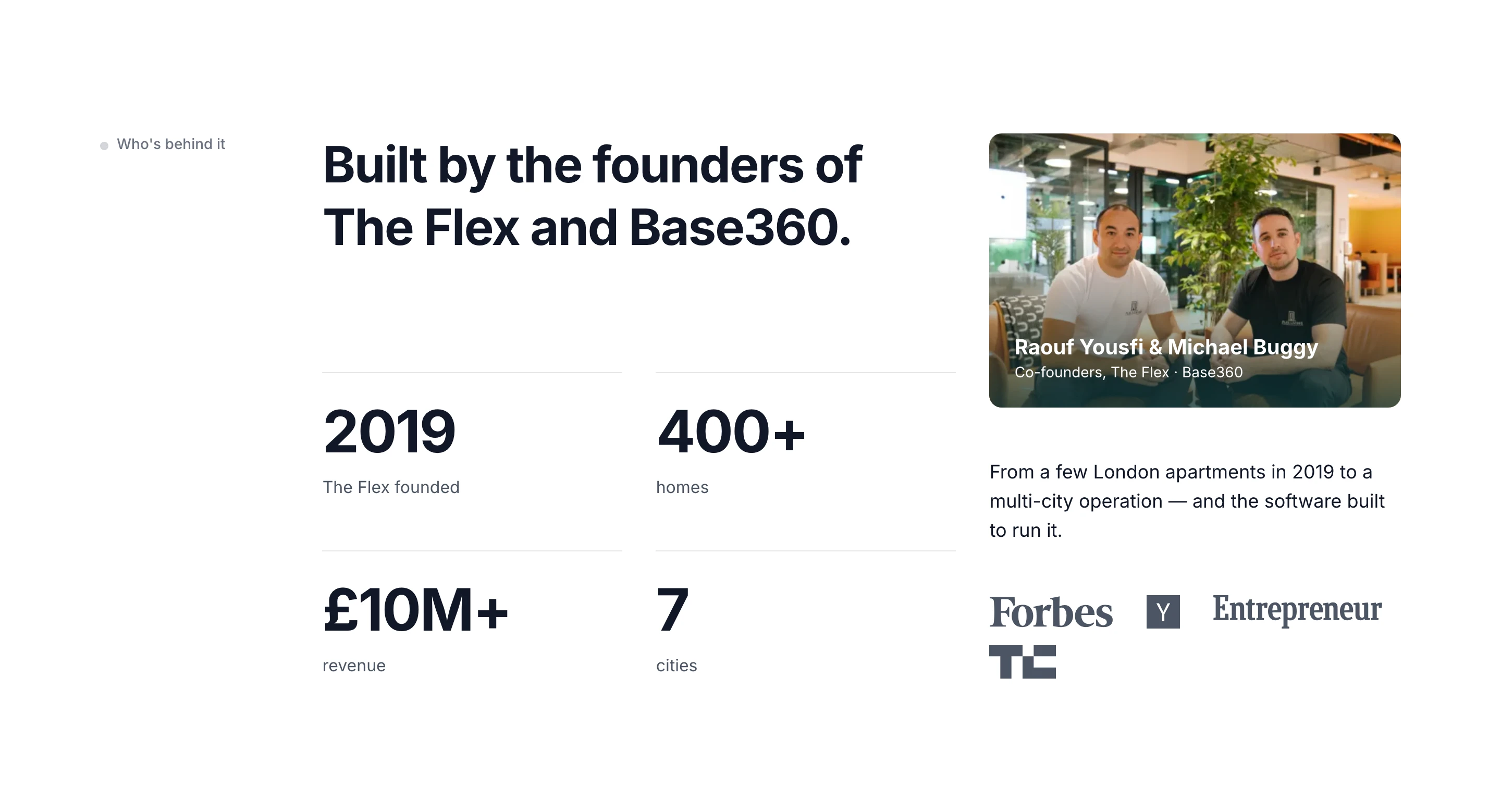
Credibility block right after the hero, before any offer.
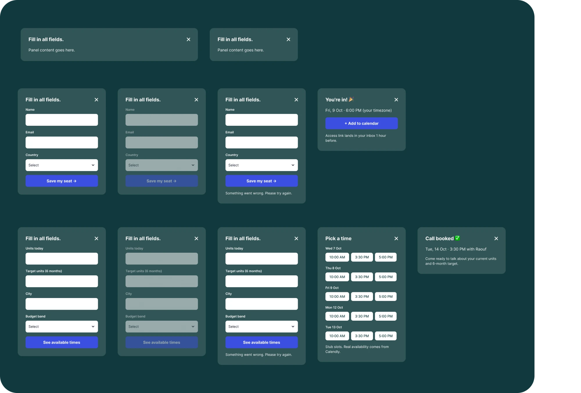
Two CTA flows: webinar sign-up and strategy call booking.
The Two Audiences
Launch is for the “9-to-5 leaver” with zero or one unit: a self-paced course, live group sessions and templates, entered through a free webinar.
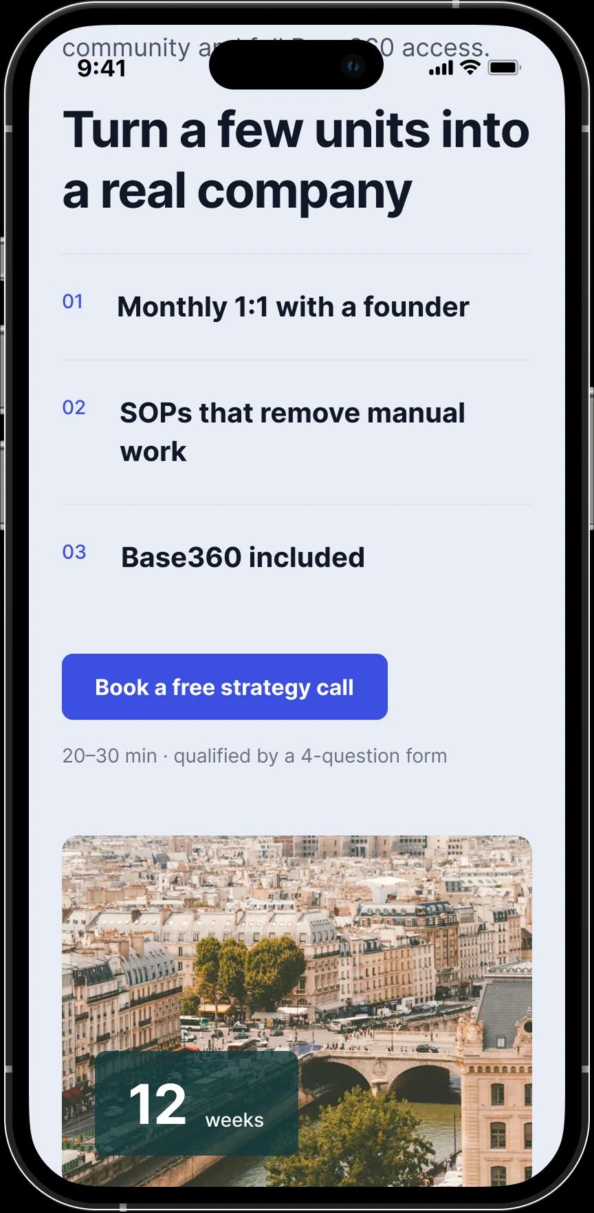
Scale is for the early operator with a few units: 12 weeks of weekly group sessions, a monthly 1:1 with a founder, community, SOPs and access to Base360, entered through a free strategy call.
Launch · Webinar
Low commitment. Name, email, country → confirmation and add to calendar.
Scale · Strategy call
High intent. Units today, target, city, budget band → pick a time → confirmation.
Not ready yet · Checklist
Secondary conversion: an STR scaling checklist in exchange for an email.
Process
1. Brief breakdown
Two personas, a pain map and success criteria.
2. Wireframes in Figma
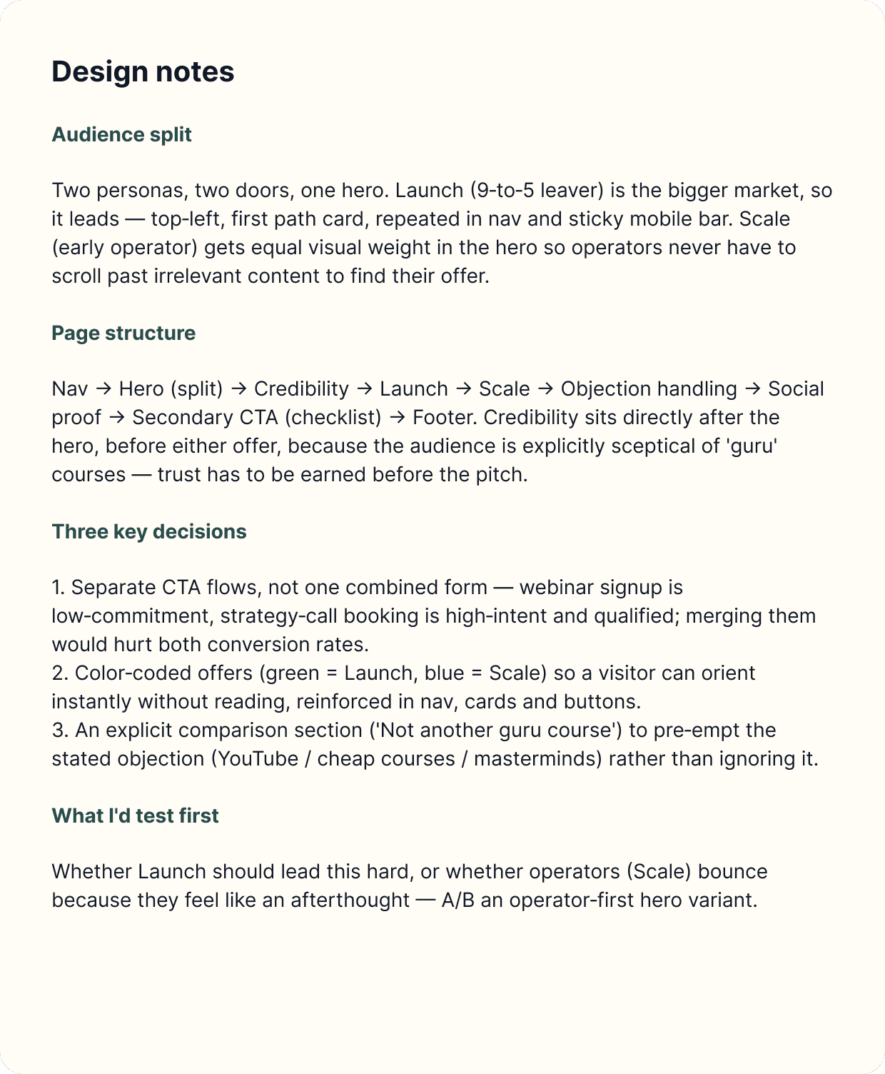
Desktop 1440, Mobile 390, both CTA flows and design notes.
3. Brand audit
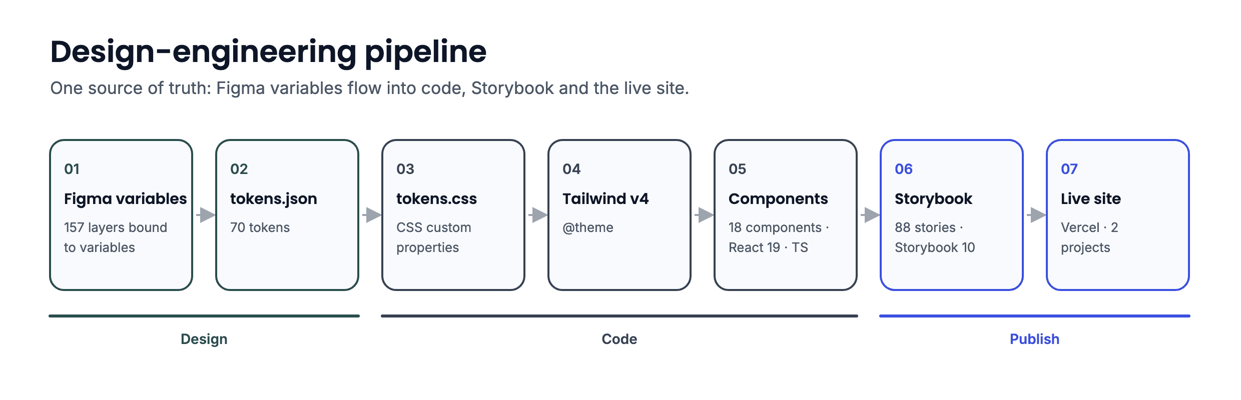
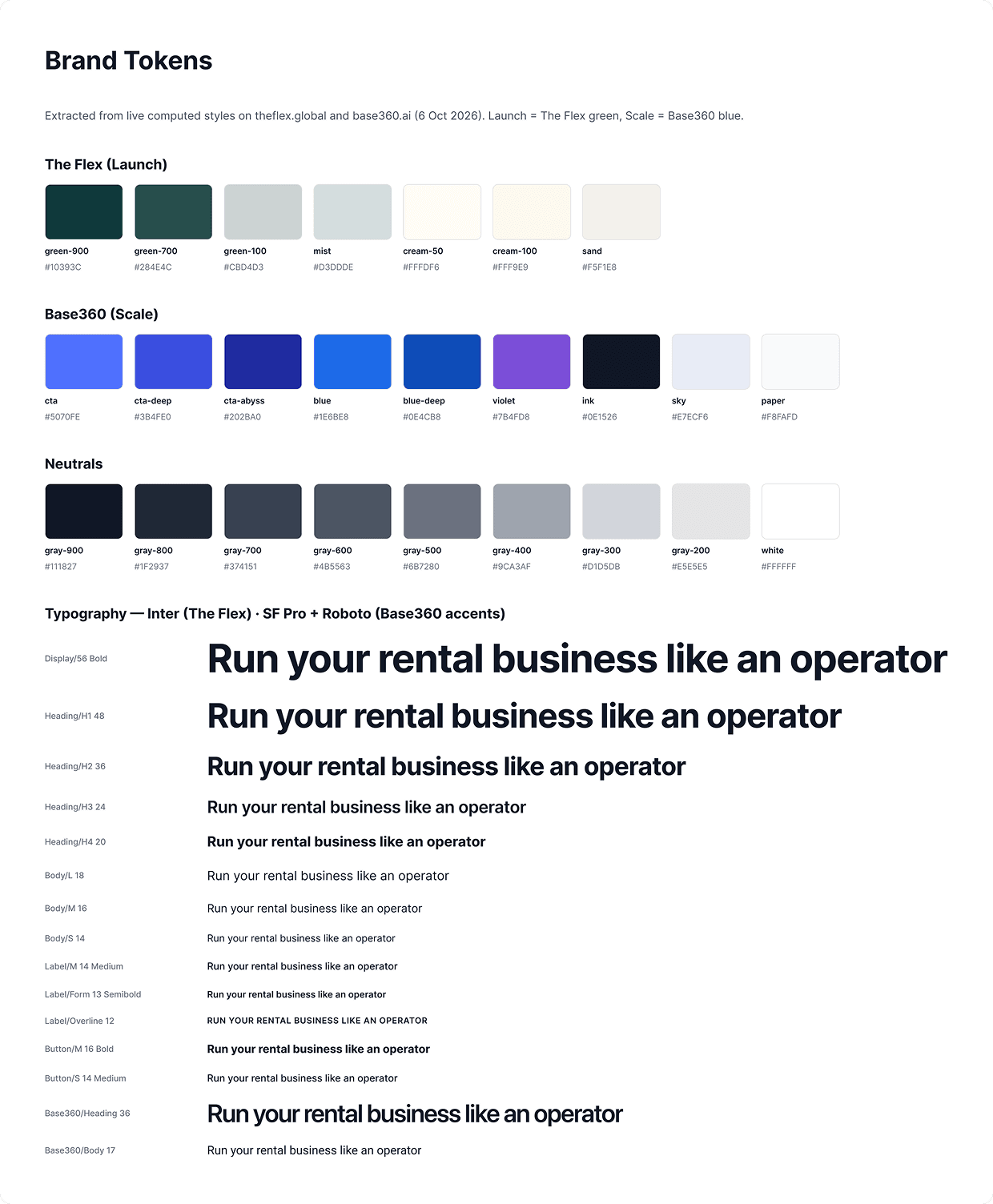
Real computed styles extracted from theflex.global and base360.ai and moved into Figma variables: primitives → semantic aliases. 157 layers bound to variables.
4. Block-by-block build
Code in the prototype → browser check → fixes → Storybook with all states and docs → mirror in Figma as a component set.
Key Design Decisions
Two doors, one hero. Launch leads because it's the larger market, but Scale gets equal visual weight, so operators never scroll past content that isn't for them. Trust before the pitch: the credibility block sits right after the hero, before any offer, with the founders, the company's public numbers (since 2019, 400+ homes, £10M+ revenue, 7 cities) and press logos.
Colour that means something: Launch uses The Flex green, the story of how the founders started; Scale uses Base360 blue, because Scale includes access to Base360. Separate flows for separate intent: the webinar is a short three-field form, the strategy call qualifies the lead first and then lets you pick a time.
Earning Trust
Meet the objection head-on
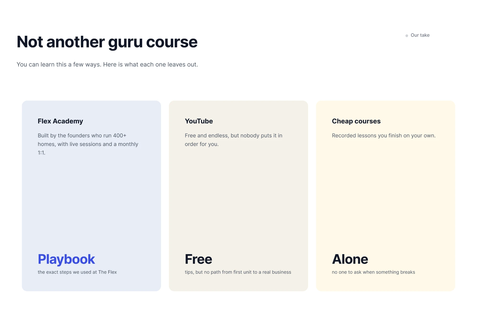
A “Not another guru course” section compares the programme with YouTube, cheap courses and masterminds instead of pretending the doubt isn't there. A separate founders block was cut because it repeated the credibility section: a shorter page instead of a repeat.
No fake testimonials. For a sceptical audience, invented quotes destroy trust, so social proof stays as clearly marked placeholders.
Responsive Design
Design-Engineering Pipeline
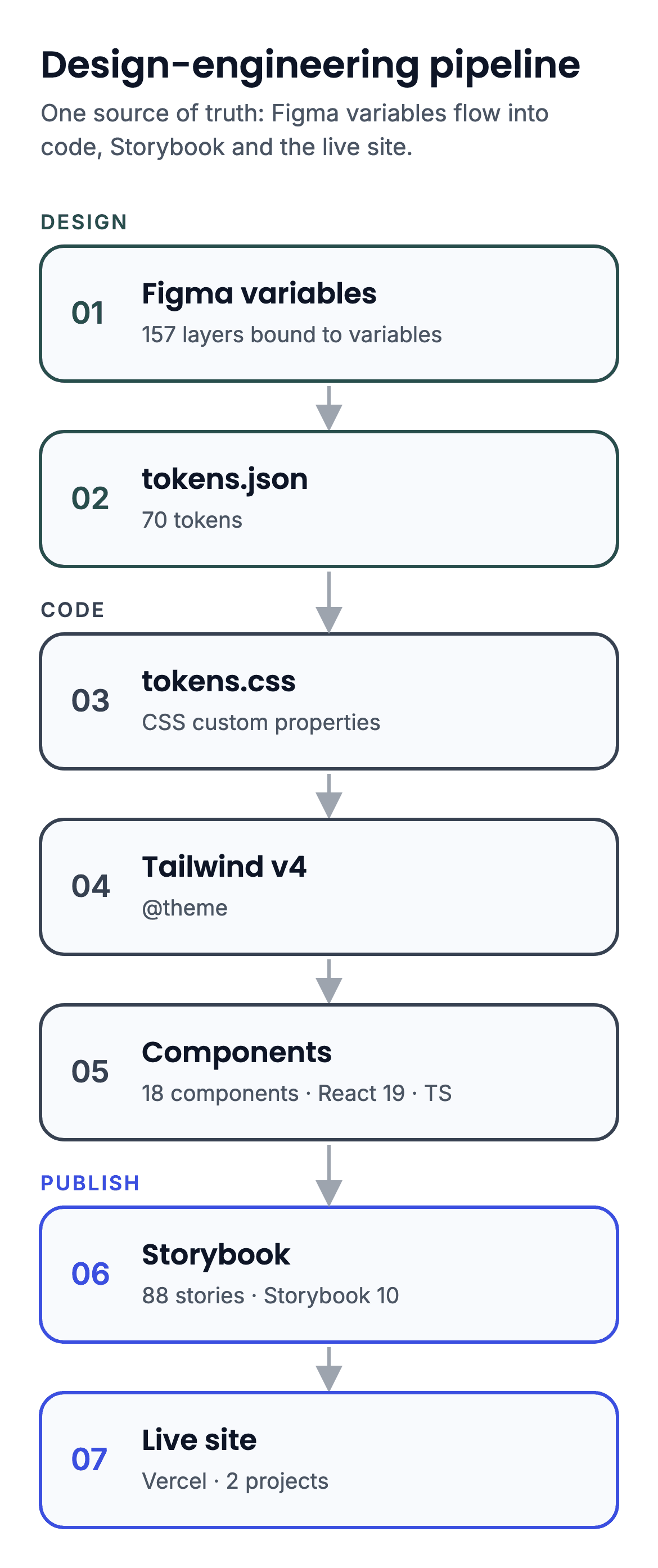
Instead of static screens, I built the page as a system with one source of truth: Figma variables → tokens.json → tokens.css → Tailwind v4 @theme → components → Storybook → live site.
Tokens from live sites
Real computed styles from theflex.global and base360.ai, not eyeballed, turned into Figma variables: brand primitives plus semantic aliases such as offer/launch and offer/scale. The same 70 tokens live in code, with no hardcoded colours, spacing or radii in components.
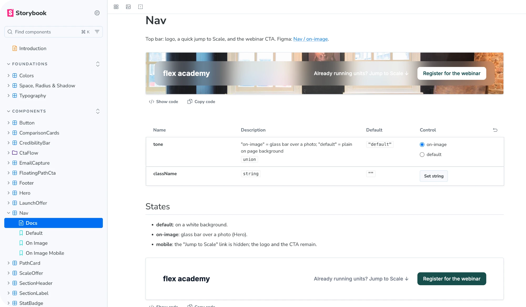
18 components, 88 stories
Every component is documented in Storybook with all of its states, props, accessibility notes and a Token Usage Report: property · token · value · source.
Honest “AI-defined” flags
Anything that wasn't defined in Figma is openly marked “AI-defined” in the docs, so reviewers see which decisions came from design and which didn't.
Figma mirrors the code
Components rebuilt in Figma as variant sets (Breakpoint, State, Tone, Step) bound to the same variables. The screens are assembled from them.
Modal + real URL
CTA flows open as a modal while the URL changes to /webinar or /strategy-call. Open that link directly, from an ad or an email, and the same form loads as a full page.
Accessibility Considerations
01
Scale uses a deeper blue (#3B4FE0, about 5.6:1 with white) instead of Base360's button blue (#5070FE, about 3.9:1), which doesn't pass AA for normal text.
02
CTA flows use a native <dialog>: focus trap, Escape to close, focus return and scroll lock. Inputs are 48px tall.
03
Scroll animations are pure CSS, with no animation libraries, and respect prefers-reduced-motion.
How I Worked with AI
I set the direction, rules and scope: what to build, how tokens are structured, naming, accessibility decisions and review criteria.
Rules, review and checks
Claude Code wrote most of the implementation under those rules, defined in project instructions, a custom skill and handoff documents. Two branches, prototype and design-system, share identical component files. I reviewed every change, ran typecheck, lint and the Storybook build, checked each block in a real browser at 1440, 820 and 390 px, and approved every push.
What I'd Do Next
Real services
Plug in real scheduling, CRM and email instead of the current stubs.
Real student stories
Replace placeholder testimonials with real student stories.
Test and verify
A/B test an operator-first hero and add automated visual regression tests to the Storybook.
Outcome
A Figma file with the design system, CTA flows and design notes; a Storybook with 18 components and 88 stories, each with a Token Usage Report; and a live prototype on Vercel built from those exact components. Design, code and docs that can't drift apart: change a token once and it updates everywhere.
By the numbers (scope of work, not business impact)
• 18 components and 88 stories
• 70 tokens in sync across Figma, Storybook and the site
• 2 branches and 2 Vercel projects
• 47 commits in prototype, 36 in design-system
• 3 days of active work (5–7 Oct 2026)
What I Learned
Treating even a landing page as a small design system pays off fast: decisions made once in tokens show up consistently in Figma, in code and in the docs, and AI tools become far more reliable when they work inside clear rules.
Honest Limits
This is a concept, not a production site. The backend, calendar and CRM are stubs, testimonials are placeholders and prices aren't shown. Safari and a real calendar integration weren't tested.